OK, today’s riddle:
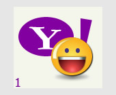
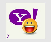
One of these two Yahoo! Messenger logos is a fake one. Which one? Number 1 or Number 2? Guess! :-)
Note (a): Opening Yahoo! Messenger right now is strictly prohibited! Opening www.yahoo.com website or any associated with Yahoo!, Inc. websites is strictly prohibited, too. Any search using Google Image Search or similar is not allowed as well:-)
Note (b): One of the graphics is the original one, copied as screenshot of the Yahoo! Messenger during sign-in; the other is made in using Macromedia Fireworks (my graphic tool of preference), in maybe 10-15 minutes. It’s up to you to decide, which is which:-)
Note (c): You can click on each the image to see the images compared (click on the left/right sides of each image after opening one of them).
Note (d): I’ll post the right answer here (or in a new post), together with the Fireworks .PNG file, as soon as I get enough feedback:-)
If you try to guess, please, post your comments below, just #1 or #2 and (optionally) why you think so, would be enough:-)
Thx:-)
PS I wanted to write first about the great adventure we had on Vitosha mountain last Saturday, but I got a nasty flu right after that, so it’ll have to wait a bit :-(
UPDATE: Comments are now closed. You may read the answer to the riddle here:-) Thank you for your participation!
______________
Sideline: Sometimes, maybe I simply want to prove to myself (and to the world) that Macromedia Adobe Fireworks is a tiny, yet powerful, full-featured program for web & graphic design; the fact that Macromedia didn’t promote it enough (think only that the Mozilla Firefox logo was made using Macromedia Fireworks and this remains quite unknown to the broad public!) only proves that Fireworks was somehow overlooked in favour of Flash/Dreamweaver — but now that Adobe owns Macromedia, I have new hopes:-) I’ll write on the subject more one of these days. For now, a small Yahoo! Fireworks Riddle is enough;-)
Just a try:
Perhaps ist the fisrt one the real one, because the second one is more rounded.
As far as I can remember something…
Not sure at all:-)
GReetings!
I think the fake is N1. Reason – N1 is with better quality and I can’t imagine you are going to convert your own work such way like N2;-)
But … the Y in N2 looks more like the Y I have in my memories from the original Yahoo… So .. I don’t know …But anyway – great job, dude ! :)
P.S. And the mouse on the top right corner is crazy cute !!!!!
Definitely the one on the left (n1). the only way I noticed is the Y is not proper like the Yahoo! branding. :) Good job though…I will also say the shadow on the teeth is a little stronger on N1 as well. If it wasnt for these two things I wouldnht have been able to tell the difference. :)
@Stas:
Good guess! Now open Yahoo! Messenger and compare;-) But don’t tell anyone here in this post, pssst! :-)
@Svetlina:
Hehe, I feel some hesitation in your answer:D But… thanks for the kind words in regard to my modest work/play and… in regard to my logo mouse, too… %ALL_BLUSHING% (It’s Fireworks work again, btw;-)
@Alan:
Thank you for your guesses (and arguments), too!:-)
I most appreciate that you took the time to evaluate the two examples!
But for now…
@everyone:
…Keep them coming, keep them coming, comments and guesses!:-)
I have to prepare new challenges for you (and for myself;-) …so I’m gathering feedback now, and a very precious one:-)
I think that number 2 is the original one, you can’t create such blurred images with flash or firefox, that’s why I think that the blurred is the original screenshot :)
I would say the first. I don’t use much Yahoo stuff, but the second one looks more like a screenshot. Also, the oval in the second isn’t really oval, and I can’t imagine you would go to the trouble of making it an irregular shape when the original is just on oval.
I can’t tell. Which is which. Nice work!
#1 is the original one
For me the fake is number 2, because of letter Y and the shadow of the left side. If it is wrong – you should offer the number 1 to Yahoo…:). Anyway- congratulations!
@Natalia:
“…you can’t create such blurred images with flash or firefox…” — I guess, you mean, “with Fireworks” ;-P
@Boudreaux:
Thx! I’ll count this is ‘neutral’ vote then? :-)
@Zlatev:
OK, writing assiduously down the vote…
@Anita:
*If* you made a wrong guess, I’ll definitely offer #1 to Yahoo!, Inc. :D
Thanks to everyone for your input up to now, it’s very valuable to me… I continue the counting…
Well, #1 should be the fake logo. What I notice is the very high definitions of all the details. It seems to be a vectorial image that can be expanded as much as one wants, without losing quality. Anyway great job! Greetings….
Sooo… I think, that #1 is the false one :-)
But something on the inside tells me that maybe both logos are fake… there’s something suspicious in all this story :-)
PS I wait impatiently the post about the big adventure ;-)
i’d go for number 1 as the fake one… don’t know why!
super cool space you guys have here.
greetings to all!!
#1 is a real one
or I like it much than #2 :-D :-P :-Ь
I guess I have no right to tell which one is yours and which is the real one, since i was behind your shoulder during the whole process of making of…;-)
As to me, number one seems to be the original one. Just a feeling maybe, but number two looks like a screenshot a little bit more than the other one. Greetings, Michel, you seem to have mastered this art – it’s really hard to distinguish them from each other; personally I do not use the Yahoo Messenger, but frankly, I wouldn’t make the difference between these two images, if one of them appears at my logon screen at Yahoo. As conclusive words, great job!
P.S.:Number two looks somehow darker than number one.
Nice to see your perfection in Fireworks again! IMHO the #1 is the one you created in Fireworks, and the #2 is the original Y! logo. The ONLY thing I can base my presumption on is the lower quality of #2 (and only after knowing one of them is not original and looking hard) which can be expected from a screenshot, compared to rasterized vector output. As I have said previously, apart from our conversation on which vector app is better, the only thing that matters is what you can do with it, and to what extent it suits your needs. I would NEVER make you work in Adobe Illustrator ;-) You don’t need anything else than what you already have :o)
I completely agree with vladi , you can’t create such blurred image as #2 in Fireworks (this time wrote it right :P), #2 is screenshot, #1 is your work, great job!
I think No 2 is fake.
i am not familiar with Fireworks or anything of the sort, but i would say that #2 is the original one. The smiley in # 2 is looking slightly to the side, while smiley #1 looks directly at you (i guess you would have to work more than 10-15 min on #2 :). Anyway, great job!!!
well, i guesss that the second is the fake one, but it’s really difficult to tell, as they’re quite similar…. good work!!!
@Enrico:
Thx:) Greetings to you, too:)
@Miki:
Both logos fake? Ha! :-D Wait a bit… :)
@Nessa:
Hmmm… And thx, it’s not yet the place we’d like it to become, but going in the right direction, I hope:)
@batpep:
OK, writing down… “No.1… is… the… real… one.” :)
@Ani:
I guess so;-)
@Adrian:
Thx, thx :-) No.1 – real one. Noted! :)
@Vladi:
Thank you for the good words on my Fireworks abilities, dear Sir:)
One day (I promised myself) I’ll learn a bit of Illustrator, too… but for now FW suits me more than well, especially in my Web projects… and when I want to make some fun;-)
@Natalia:
Thx, thx, thx:) Writing down: #1 – my work…
@Julia:
Writing down: #2 – fake one (my work), #1 – real one.
@Nisi:
Writing down, and thx:)
@Polina:
Writing down, thank you:)
@everyone:
Thanks for all the feedback! Thank you all for the appraisals to my modest graphic skills. No, I am not so good, I think I just hold the right tool – Macromedia Fireworks – and it does the biggest part of the task:)
Maybe it’s time to reveal the truth in a second post, dedicated to the Yahoo! logo forgery ;-) (I might even write a short tutorial on how I did it, if there’s some interest:-)
Number 2 is the original one.
Hmm, I think both logos are by Yahooooooo! :)))
Now seriously: as much as I look at both graphics, I can’t find any difference, because there’s almost no difference at all… (OK, maybe in this case I should mention that I visited Yahoo! last time about a year ago;-)
Go ahead and maybe you’ll catch up with me one day ;-) ;D